 "Nibby" (nibby68)
09/03/2015 at 13:42 • Filed to: None
 2
2
 13
13
 "Nibby" (nibby68)
09/03/2015 at 13:42 • Filed to: None |  2 2
|  13 13 |

Thoughts?
 Supreme Chancellor and Glorious Leader SaveTheIntegras
> Nibby
09/03/2015 at 13:45 |
|
 Iheartstorms
> Nibby
09/03/2015 at 13:46 |
|
It sucks and I hate it. It’s almost as bad as the new layout of The Washington Post’s website and the terrible font that's been appearing and disappearing on some of the Kinja mobile sites. What is going on with the internets this week?
 Laird Andrew Neby Bradleigh
> Nibby
09/03/2015 at 13:47 |
|
I actually like it. Will take some time getting used to it, butt I like it.
 Eric @ opposite-lock.com
> Nibby
09/03/2015 at 13:47 |
|
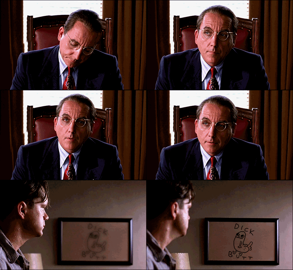
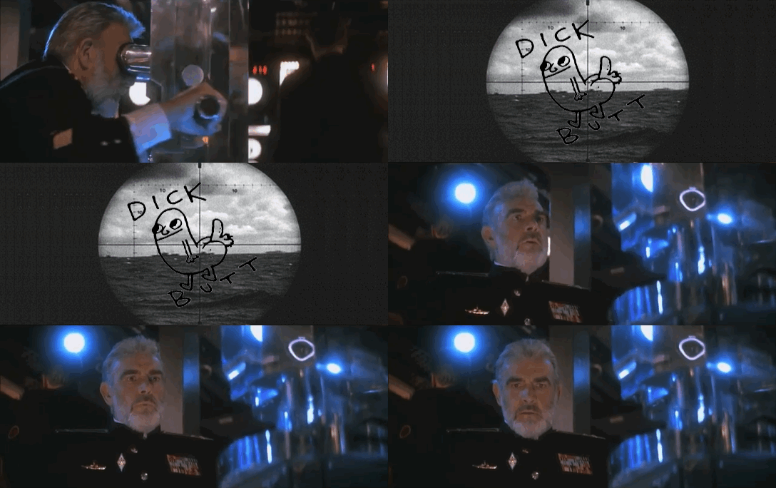
I see dickbutt.
 CalzoneGolem
> Nibby
09/03/2015 at 13:48 |
|
Same ol’ dick butt.
 HammerheadFistpunch
> Nibby
09/03/2015 at 13:49 |
|
I think snap beat you to it.
 Nibby
> HammerheadFistpunch
09/03/2015 at 13:57 |
|
I posted it on G+ before he posted it here.
 HammerheadFistpunch
> Nibby
09/03/2015 at 13:59 |
|
Fair nuff
 qbeezy
> Nibby
09/03/2015 at 14:09 |
|
A lot of companies are going to softer colors and fonts, including my own with rebrandin .
 pjhusa
> Nibby
09/03/2015 at 14:14 |
|
the end of a whole age
But I like it.
 PushToStart
> Nibby
09/03/2015 at 14:56 |
|
I don’t care much either way, but if I had to pick one over the other I’d say the old one was better. It was distinctly Google, this just looks like another common “modern and round” font. While the old font was still definitely plain, it's not like any one else was using a similar typeface.
 Alex B
> Nibby
09/03/2015 at 15:11 |
|
I don't like it. It looks like 70s font.
 pip bip - choose Corrour
> Nibby
09/04/2015 at 05:46 |
|
meh.